Despite advances in eLearning technologies, many eLearning developers who cater to mobile learning platforms are still stuck in the old mode of thinking – designing separate courses targeting multiple different devices. This design process requires extended development time, increased cost, and causes unnecessary complexity for the user. It is important for designers to make the change from creating for devices to focusing on the user’s experience.
eLearning Design: Why Make the Change?
When the Apple iPhone first came on the scene, many designers began creating content for both Flash-based PCs (eLearning) as well as a separate version for use on mobile devices (mLearning). That’s double the work at increased time and cost. It also results in user confusion – a learner accessing the course on a workstation within the business would have a different experience than if they were to access the same content from their tablet or phone. Other problems that resulted include a reduction in completion rates and user satisfactions. With today’s tools and techniques there is simply no longer a need for two separate versions of the same course.
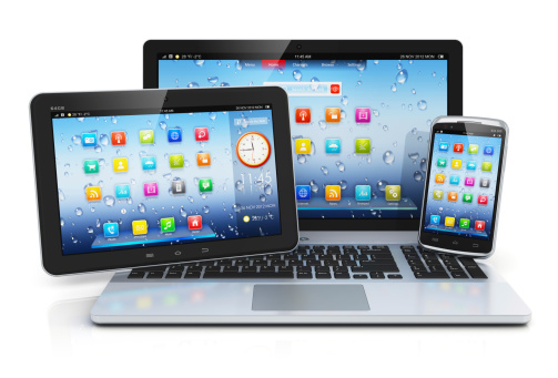
Device Agnostic Content
Some pundits term these new development needs as device agnostic content. This term refers to content that can be accessed from multiple devices and looks identical (or very similar) on all those devices. Users can access eLearning materials from a desktop or laptop, but also by using tablets, smartphones, and even smart TVs with Wi-Fi connections. Device agnostic content can be compared to responsive website design, which ensures that users receive the same experience no matter what type of device is being used to access the website, whether it’s a smartphone with a four-inch screen or a desktop PC with a 22-inch monitor.
Make Mobile Learning A Better Experience
The non-device-centric design offers several advantages for eLearners. For instance, a learner could start a course on the job and then continue later using their smartphone. Learners could also work on the course from home using a personal computer or device. Throughout all of these handoffs, the content, design, and layout would remain the same, offering the learner a continuous, seamless experience. This goes beyond providing a better user experience. It encourages faster completion of courses and increased user engagement.
The Challenge
The hurdle to creating non-device-specific content is that eLearning designers often are not sure how the course material will display on different devices. Using the right tools, including Adobe Captivate and Letora include built-in features to make mobile learning “responsive”. Additionally, coding courses directly using HTML5, designers can create courses that work on all HTML5 friendly devices. It is also more cost effective than many other tools and offers a streamlined customization process.
By creating content for learners, not for devices, designers are able to provide a streamlined, positive eLearning experience.