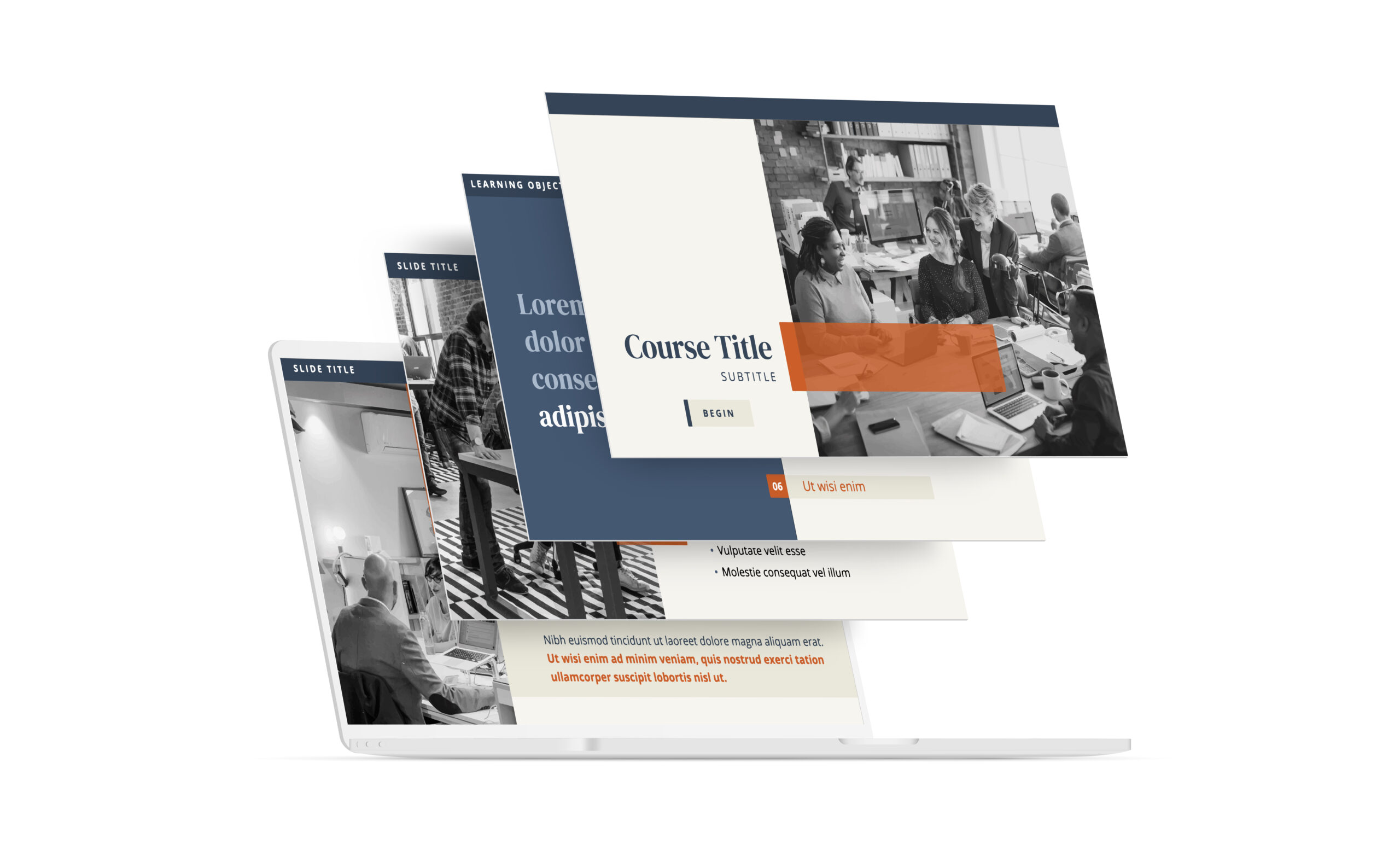
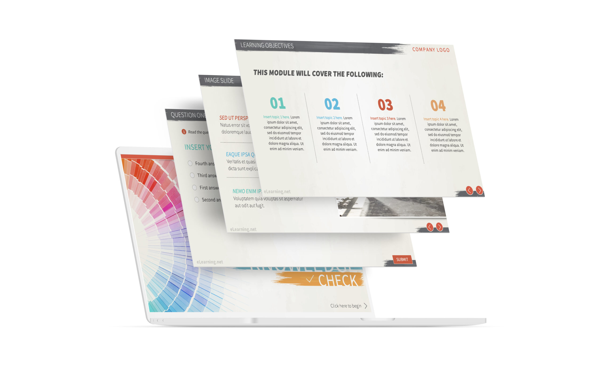
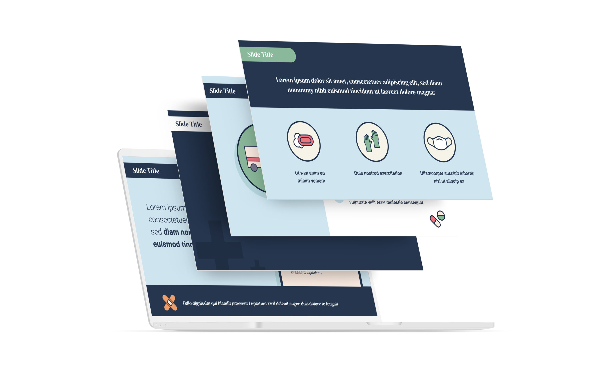
Those in the eLearning or graphic design fields are well aware of the shifts taking place in the presentation of professional development and employee education. The transition from text-based courses to a more immersive environment with graphics, illustrations, and animation offers a number of advantages including greater knowledge retention, increased learner engagement, and faster course completion times. However, designers must be knowledgable about graphic design within the eLearning environment to ensure the best possible eLearner experience.
eLearning Graphic Design With a Purpose
While some graphic embellishment for the sake of creating atmosphere is allowable, graphics should be used only if they serve a purpose. This applies to all elements such as the business logo (branding) and internal elements (navigation and interaction).
Just because something can be created and implemented does not mean it should be included.
eLearning Content Trumps Graphics
ELearning relies on visual aids; good design is an important consideration for creating an immersive, enjoyable user experience. However, content still trumps graphics. All graphic design elements should work in support of the content of the eLearning course.
Design Typography
Most eLearning courses rely primarily on text. Design choices for typography that are carefully selected can make a course more enjoyable. Designers should understand which fonts work best on computer monitors, tablets, and smartphone screens. While typography can be beautiful, even elegant, readability is paramount.
Image Selection
When selecting photographs and other graphic elements for the course, it is important to start with the largest files available. This will ensure the best resolution when the image has been cut, cropped and resized to fit on the screen. Remember that an image can always be reduced without sacrificing quality, but it cannot be expanded without pixilation occurring.
Avoid the Wall of Words
The “wall of text” effect makes it hard for eLearners to hold a place in a paragraph. Turn text into bite-sized chunks and augment those with graphics when necessary. Use line spacing to spread paragraphs over the page. Too much text is overwhelming. Breaking it up into chunks will ensure that eLearners are able to digest each piece before moving on to the next.
Whitespace – The Designer’s Friend
There’s a natural aversion among designers to using whitespace. It practically begs to be filled up with something. Avoid this.
Whitespace can be a powerful part of overall graphic design,
helping to lead the user’s eye down the page,
to delineate specific areas,
and to break up graphic elements
or text.
The Navigation No-No
Graphic designers love to innovate. Creating something new is what they do. However, navigation should be kept simple, recognizable, and easy to use. Creating custom navigation icons that blend with the overall design is a nice effect, but there is such a thing as blending too much. The same applies to actively hiding navigation icons for the sake of design. Don’t do it.
With the right steps and a little vision, designers can create an immersive, unique eLearning experience that ensures knowledge retention and learner engagement. The wrong steps can lead to a negative user experience, disengagement and disconnection.